From Acapulco to Zurich

For cities of all sizes, branding offers all kinds of opportunities—and plenty of challenges
From the Big Apple to the City of Love, the world’s iconic metropolises enjoy strong brand identities, developed organically as they evolved over the years.
But as economic power further consolidates and competition grows, less-storied cities across the globe are increasingly turning to branding to differentiate themselves by focusing on what makes them unique—and worthy of investment.
Even if you’re not a municipal employee, place branding offers a few lessons that anyone in marketing could find instructive—particularly as it relates to defining a competitive advantage that’s firmly rooted in reality and determining who your stakeholders truly are.
In a 2014 journal article, marketing researchers Ram Herstein, Ron Berger and Eugene D. Jaffe articulate the incentive for cities to turn to branding, saying, “with city revenues declining, small businesses closing and consumer spending declining, cities must strategically reposition their approach to economic development.”
Branding, they claim, can be used by cities “to unite their stakeholders around a new competitive identity and to communicate their message to target audiences.”
In some cases, that may involve pivoting away from what a city used to be known for, such as a formerly industrial city moving toward culture and art (Glasgow).
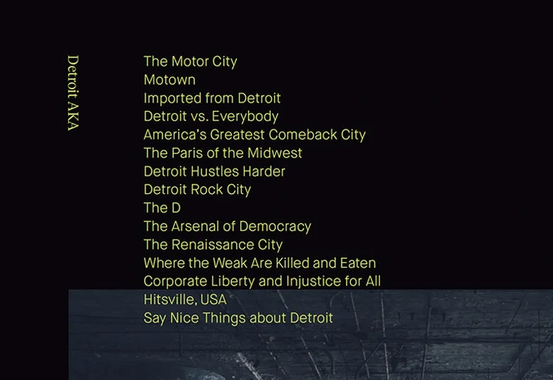
In other cases, it’s by playing up your “weirdness” (Austin, Portland and even Louisville) as other urban centres become more and more homogenous. It could be positioning yourself as investment-friendly and industrious when perceptions of the rest of your country are of a more relaxed lifestyle (Guadalajara). Or embracing a perception of your city as a signifier of toughness and entrepreneurial spirit (Detroit, home to more slogans and monikers than one can count).
In Canada, where municipalities are generally less able to levy or lower taxes due to provincial legislation, branding is an even more essential tool in a city’s arsenal for distinguishing itself, whether that means attracting more tourists, more businesses, or more residents to pay taxes and spend more money within the city limits.
Sometimes, it’s as simple as a city slogan that sums up a peculiar but rather unique aspect to the city.
Kamloops, British Columbia, certainly lost out in the looks department to other Western Canadian cities, such as Kelowna, Calgary or Vancouver. But with a central location and long history of sports tourism to draw from, Kamloops’s municipal government smartly landed on “Canada’s Tournament Capital” as a slogan in 2001, copyrighting it and plastering it on welcome signs and city communications ever since. No slogan can encapsulate everything about a city, of course, but “tournaments” effectively captures recreation, sports tourism, competitiveness, and a healthy, active population in one word.
In 2008, with the help of a Victoria-based branding agency, Kamloops built out the brand to include a colourful visual identity and a city website geared toward attracting more outside investment in sports and cultural events.
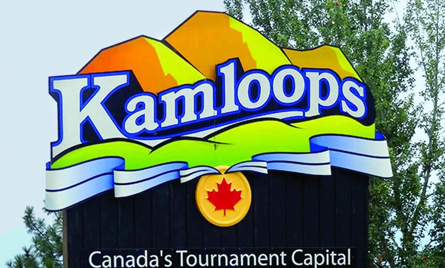
Since the early 2000s, the mid-sized city of some 100,000 people has seen more than $90 million pour in from federal, provincial and municipal governments to build and maintain athletics facilities and support amateur and professional tournaments from around Western Canada, including the Brier men’s curling championships in 2014 and the 2016 IIHF Women’s World Hockey Championships. And those investments have attracted visitors—for example, an estimated 30,000 people, or about a third of the city’s population, visited Kamloops in 2010 for tournaments and cultural events alone. While “tournaments” isn’t necessarily a sexy branding position, it’s unique, memorable and undeniably effective.
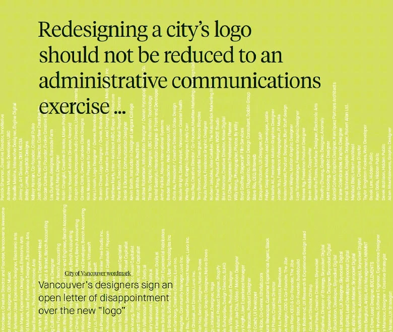
Not all municipal branding efforts are created equal, however. Consider a recent case from Vancouver. In 2016, city council sought to update the city’s official wordmark to make it more readable for people with a limited grasp of English or ability to distinguish Roman characters—an important consideration as the city further positions itself toward the Asia-Pacific region. The city council contracted an agency to design a new wordmark for a paltry $8,000 in an effort to keep costs low, and ended up with a wordmark that could be recreated in less than 10 minutes in Microsoft Word.

Seriously. It’s just “City of Vancouver” using the Gotham font in blue and green. Even worse, it’s nearly identical to the wordmark that nearby Chilliwack—a community that Vancouverites have long been known to, um, look down upon—had been using for some time.
Predictably, the local design community was outraged about not being consulted on something as omnipresent in their daily lives as the city wordmark—it graces every official letterhead, sign and civic building—and the city’s reputation as a haven for creatives ossified further.
“Redesigning a city’s logo should not be reduced to an administrative communications exercise as it has been for the approval of this new wordmark,” read an open letter signed by dozens of prominent Vancouver designers.
“A city’s identity is sacrosanct. It is our mark in the world. It represents who we are as a people and our collective values. It symbolizes our history and aspirations for the future. … Civic identity is what unites us as a city and distinguishes us from the world.”
Thankfully, Vancouver’s city council heeded the concerns of the design community and stopped the rollout of the new wordmark.
But the Vancouver case demonstrates one way that running a city is a vastly different proposition from running a business. Pesky things such as “democracy” and “public funding” mean the processes of assessing, designing and implementing a branding effort are often drawn out over longer periods of time and encumbered by the opinions of thousands of citizens who are (rightly) interested in shaping their city’s direction. Think getting your C-suite to buy in on a rebrand is difficult? Try getting 30 city councillors up for re-election every four years to do so.
Whatever the faults of the “simplest is best” approach adopted by Vancouver, it could be worse. In 2001, Ottawa rolled out what is perhaps the single worst marketing slogan a Canadian city has ever seen: “Technically Beautiful.”
Trying to cleverly play up Ottawa’s then-booming tech industry instead came across as an outright insult to a city known across the country for being aesthetically pleasing. The slogan lasted all of four months.
Capital, both of the human and financial varieties, is only going to continue concentrating in urban centres. While the differences in process between corporate and public branding are clear, the underlying principles of both remain the same. A strong, effective city brand is based on deep discussions about how and why people live there: determining what you do well, what you do differently and how to express it.
Dare we say it as a piece of parting advice: it’s better to be a Kamloops than a Vancouver.