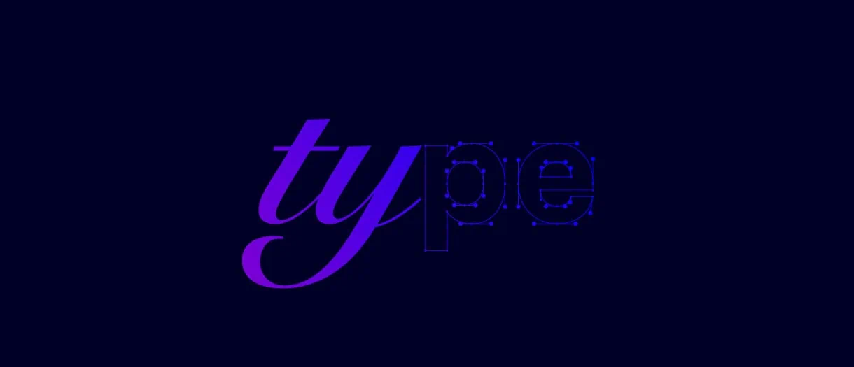
The art & science of typeface selection
Summary
The right typeface helps express your brand identity, uniqueness and style. But it also needs to be easy to understand and able to be used consistently across all
media and applications. We summarize the three main factors to consider when choosing a typeface for your brand.
The right typeface is an integral part of your brand’s visual language. It influences how your brand is perceived and remembered. Selecting a typeface is an important decision—and, in addition to your choice of style, you must also account for technical requirements, function and cost.
Behind every successful brand is a well-considered typeface. From Apple’s sleek, digital-friendly (and custom-made) San Francisco to Tootsie Roll’s fun use of Cooper Black, typeface differentiates a good brand from its competitors in a crowded market.
The thinking behind selecting a typeface goes far beyond mere aesthetics. At our agency, we consider every client’s technical and design requirements to create a well-researched plan that can shape the perception and success of their brand.
The right typeface conveys personality and evokes emotions, establishing a connection with your audiences. It must help reinforce how your brand is recognized. And it needs to be versatile enough to work across social media and the web, print and signage, tote bags and t-shirts, large and small applications.
How do you know which typeface suits your brand personality? How do you determine if you want an existing typeface or to create a custom-made one? What cost implications does each choice have?
Here’s a look at how we think through the options to help you make an informed decision that best represents your brand.
1. STYLISTIC CHOICES
While selecting a typeface involves a healthy mix of practical considerations and aesthetic motivations, the final choice should go beyond what “looks good.” A typeface can capture attention and help make you visually different from your competitors. Your typeface should speak to your audiences, evoking emotions and creating visual associations with your business.
We consider your brand’s tone and personality
Your typeface needs to align with the personality of your brand. Based on the tone and voice you want to convey, we consider the visual and emotional aspects of your brand: playful, sophisticated, professional, modern or traditional—there’s a plethora of typefaces for each of these characteristics.
For example, a playful brand might opt for a whimsical and rounded typeface with friendly curves and unconventional letterforms (think Dunkin’ Donuts). A professional brand catering primarily to a B2B audience might choose a sleek and elegant serif typeface that carries authority (like Union Bank of Switzerland). If you consider yourself a modern brand, you may lean toward a clean and minimalistic sans-serif typeface conveying simplicity (Alphabet). A traditional brand may be more comfortable with a classic serif typeface of timeless elegance and heritage (Tiffany & Co.).
We consider the legibility and readability of the type
By legibility, we mean the ease with which individual letters, numbers and other characters can be recognized and read, while readability refers to how well the overall text can be understood in any format or application.
Sometimes, typefaces that are excessively decorative or have intricate details can prove to be hard to read in smaller sizes or lower resolutions. We prefer ones that have been designed to be read clearly, even at very small sizes, or a secondary typeface that solves those technical issues.
Do you want the typeface to look timeless, contemporary—or even trendy?
This decision relates to your brand’s personality and tone. To begin, we study your industry.
A timeless typeface is more suited to a professional or serious audience, one that’s looking for trust and loyalty—financial institutions, healthcare, law, luxury. The appropriate typeface will feature balanced proportions and clean lines, showing a sense of reliability and stability.
A trendy typeface, on the other hand, is usually more visually attractive to younger audiences or those looking to be entertained, and usually works best in industries such as social media, tech, music, food & beverage, fashion and other fast-moving consumer goods. It will be in line with the latest design aesthetics, and convey freshness and fun.
Choosing between serif and sans serif
A serif typeface has more contrast between thick and thin lines and flairs at the ends of each character. A sans serif has less contrast and no serifs. While serif is more traditional and has a sense of elegance and formality, sans serif is modern and minimalistic; in some cases, it can feel informal.
There have been decades of debate on whether serif fonts are easier to read in large passages, like in books, newspapers or textbooks (despite strong opinions on both sides of the argument, we’re of the belief that neither is better, and this is backed up by research). A sans serif, on the other hand, will almost certainly be better suited for the web, mobile, TVs and digital screens, due to challenges of resolution and qualities across all types.

2. TECHNICAL REQUIREMENTS
Next, we look at the technical specifications for your typeface (this is where an agency’s experience really matters). While stylistic choices satisfy your visual personality and voice, technical aspects ensure that your typeface is cross-functional and multi-purpose. Here are some points we check when we pick a typeface:
Does it have a web-optimized version?
It isn’t possible to use a print-only-optimized version of a typeface for the web. We make sure there’s a proper web version that has been modified to reproduce better in digital applications.
Most modern typefaces usually are, but it’s good practice to check. This includes confirming that the typeface:
- is available in web font formats (Web Open Font Format)
- has smaller file sizes, ensuring a faster webpage loading time
- is compatible across browsers, platforms and devices
Does it have multiple weights?
A typeface with multiple weights offers flexibility in design and creates a sense of visual hierarchy with typographic elements. It enables you to guide the reader through a brochure, for instance, by using heavier weights for titles and lighter weights for body text—all while ensuring legibility and readability. Ideally, we go for typefaces that provide a variety of weights: thin, light, regular, medium, bold, italic and black.
However, it could also be part of a brand’s style to only use one typeface with one or two weights.
Does it have glyphs and fonts in other languages?
Most font selection we do is in English or French. However, if your business operates in regions with languages beyond these two, we’ll ensure the typeface has multilingual support and includes the required diacritics, accents, glyphs, symbols, punctuation marks, currency signs or other characters that you may need.
What will be the alternative system typeface?
Microsoft Office applications (such as Word, PowerPoint or Outlook) and other software generally offer very limited font support. Because of technical and licensing issues, you won’t be able to consistently upload or use your unique primary typeface(s) in these contexts—a problem that’s compounded by the cost to license each non-system font for every additional computer (or “seat”) that will use it.
That’s why, in addition to each of your primary typefaces, we choose an alternative “system font” (like Arial or Times Roman) that best complements your brand’s identity.

3. COST AND LICENSING
Along with stylistic and technical aspects, the third key consideration involves cost and legality.
Created by established designers or foundries, typefaces have a varying range of costs, and we take this into account during our research.
Custom typefaces will have a unique design that is exclusive to your brand, but at a much higher cost (and a longer timeline). Many larger brands even choose to create a custom typeface—doing so provides the flexibility to tailor it to the needs of the brand as well as incorporate a uniqueness or artistic flair that draws attention to it.
EXAMPLES OF GOOD TYPEFACES
To put it all into perspective, here are a few instances where we think brands made a well-informed typeface selection:
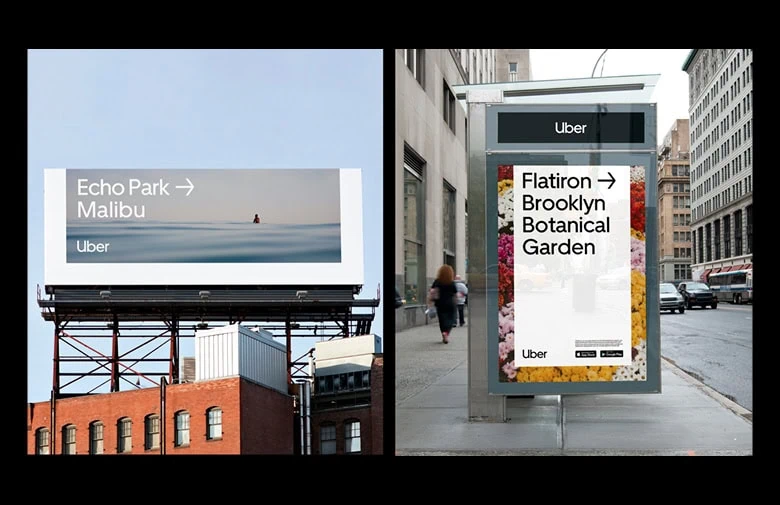
Uber
Uber uses two custom typefaces: Uber Move (for titles) and Uber Move Text (for body). These fonts are legible and use the same visual system over 13 languages. The brand’s decision to go with a bespoke typeface was motivated by a need to look and feel universal, conveying a cohesive identity anywhere where in the world.
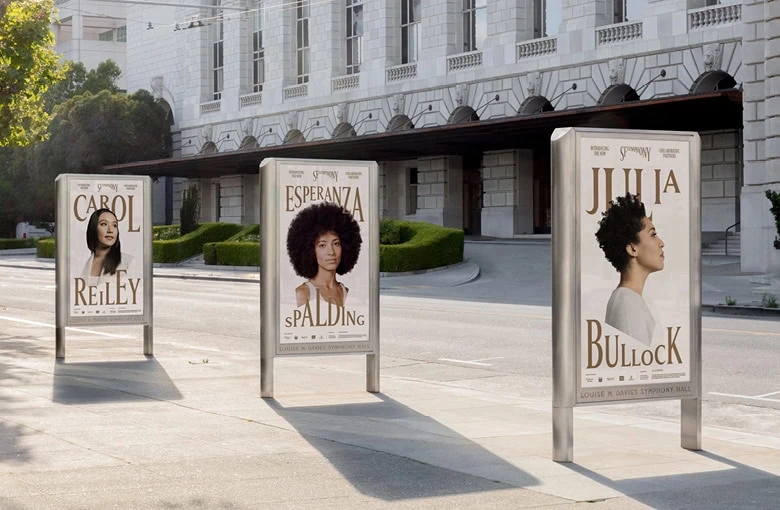
San Francisco Symphony
With music being central to this brand, and an aim to reposition the formality of classical music for the freshness of modern times, this example has a sonic-visual quality—including a dynamic variable font that responds to sound, moving up and down like notes on a score.
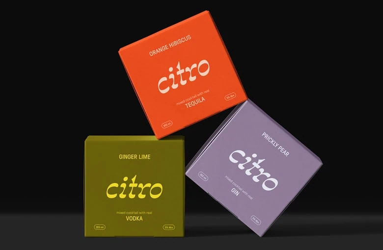
Citro
Leveraging the visual style commonly associated with craft beers and canned cocktails, Citro aims at a fun, social and urban audience with GT Pressura—a legible and attention-grabbing typeface that works well on its packaging, with a “quiet boldness” in its uppercase style, complementing the more expressive typeface of brand’s wordmark (which uses Spindle 2.0).
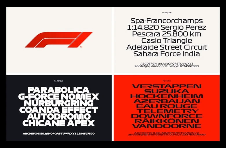
Formula 1
Developed during Formula 1’s rebrand, F1 Regular, F1 Torque and F1 Turbo draws its personality from the race track, built with the characteristics of speed, technical prowess and a futuristic aesthetic.
READY TO MAKE A REBRANDING DECISION?
Now that you have an idea of the considerations that go into selecting a typeface, it’s time to get the ball rolling on your branding or rebranding.
A branding agency like ours can be an integral part of for the success of this crucial investment—we have the design expertise and resources to bring your brand to life through all of its aspects: strategy, messaging, design (including typefaces, of course) and implementation. Feel free to get in touch!