What’s the secret behind a good logo?
Summary
For every “rule” about making a good logo, there’s a successful logo that seems to break that rule. Instead, designers need to focus on removing the obstacles that would prevent a logo from being
great. We share some criteria to help you see what your logo should accomplish, from legibility at small sizes to adaptability for social media avatars and icons. But the final factor in making a good logo great is the strength of your total brand experience.
Logos are everywhere, but how well do we really understand them?
“A logo is not communication. It’s identification. It’s the period at the end of a sentence, not the sentence itself.” —Sagi Haviv (graphic designer and partner in the design firm Chermayeff & Geismar & Haviv)
In most modern societies, homes and workplaces are covered in logos. From toilets to TVs, computers to clothing, our daily objects are branded like never before.
But how much do we know about these ubiquitous symbols, names and pictures?
Think about it this way: if Nike made bad shoes, would the logo still be “good”? Probably not—because our understanding of a logo is based on our subjective experience with a brand. A good experience = warm feelings about the brand, and thus affection for the logo. A bad experience = bad feelings, no matter how clever, illustrative or harmonious the logo is.
So, let’s say you have a great brand experience. How to decide on a logo to best punctuate that experience?
Let’s start by looking at the different types of logos and how they work.
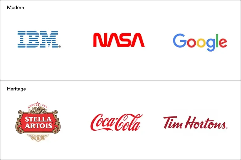
Wordmark logo
Like its name suggests, a wordmark logo consists of letterforms only. This type of logo offers the easiest way to know and remember the company name when initially viewed.
These logos can:
- look very modern (like IBM, NASA or Google) or
- imply a strong heritage (like Stella Artois, Coca-Cola or Tim Hortons)
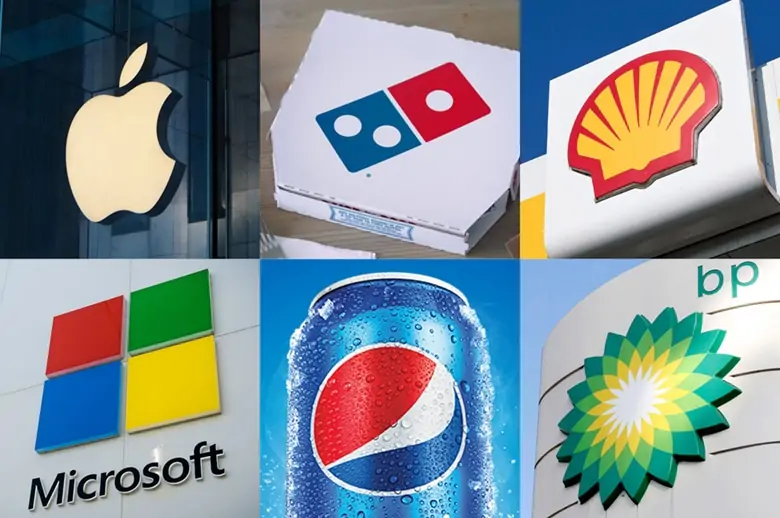
Pictorial logo
A pictorial logo often acts as a rebus—an image that is shorthand for the name of the company (such as Apple, Domino’s Pizza or Shell).
Abstract iconography
Abstract marks are often graphically the boldest, but they usually take the most work and resources to get people to understand them (that is, you’ll need a lot of advertising and marketing).
That’s because abstract logos often start with almost no easily understood visual cue to help the viewer understand what they are seeing (think of Microsoft, Pepsi or BP).
Are there rules to greatness?
Any one of these logo types can be used to create a good and sometime a great logo. But what are the details that make them great? Well, to start, they should be:
- simple, unless they are complex (for instance, Budweiser)
- bold, unless they are elegant (Chanel)
- strongly coloured, unless they have no colour (Uber)
- easy to read, unless they are challenging (pretty much any death metal band)

As you can see, there are no rules that work in all cases. And this is what makes creating logos such an intriguing challenge. At our agency, we judge a logo by how it functions—it should:
- work in full colour as well as black and white
- be legible when applied large and small sizes
- work in horizonal and vertical spaces
- have an element (or abbreviation) that can be adapted for social media avatars and website favicon
- not be confused with a competitors’ logo (no copy cats)
While these aren’t rules for achieving greatness, they clear away some of the immediate obstacles that would actively prevent a logo from being great.
The rest is up to the creativity of the design, and the consistency of its application—time is the final element in creating a great logo.
The importance of time was summed up best by Michael Bierut, who has been a partner in the New York office of Pentagram and is a Senior Critic in Graphic Design at the Yale School of Art:
“Whether we want to acknowledge it or not, anyone evaluating a brand new logo at first glance is—to paraphrase my partner Paula Scher—reviewing a three-act play based on what they see the moment the curtain goes up. Or, to put it differently, they think they’re judging a diving competition when in fact they’re judging a swimming competition. The question isn’t what kind of splash you make. It’s how long you can keep your head above water.”
Taking it a step further: Logo system
Whether you choose a wordmark, pictorial or abstract logo, you can take it a step further and create a “logo system.” In a system, the logo lends itself to its context. Some of the most famous of this type are the MTV logo from the 80s, the current Google Daily Doodles, or Hillary Clinton’s presidential campaign logo.
A logo system is extra flexible and creatively exciting; its application is often driven by technology and digital media. Each version of the logo can point or lead you to a different service, product or idea.
The only downside is that a logo system is also the most expensive to create, apply and manage.
Film and TV company A24 famously adapts its identity system to match its productions.
The secret to a great logo? A great brand.
Here’s the secret to making a great logo—start with a good one and add a great company, product or experience to it. Once you have that brand experience in place, your audiences will associate the logo with that experience, and—voila!—you will have a great logo.