Fero International
B2B / Brand implementation / Brand strategy & positioning / Content creation / Corporate communications / Ideation / Key messaging / Logo & brand design / Marketing / SEO & Digital Strategy / Squarespace implementation / Website design
No business wants to become a victim of its own success. That’s what the team at Fero International understood when they approached us to work with them on developing a new visual identity.
Fero was established with an innovative idea: repurposing shipping containers to be modular and durable mobile health units to ease the burden of “hallway healthcare.” Fuelling their potential success was Fero’s robust engineering, state-of-the-art technical specifications and proprietary technologies, including a patented ventilation system that makes the units particularly well suited to the COVID-19 (or future) pandemic.
With initial success came the opportunity to grow into other fields besides healthcare: modular housing, disaster relief, military bases and temporary offices. But Fero’s logo focused on the medical context. And with more competition emerging in their field, the team knew they needed a more sophisticated visual identity that helped them stand out and articulate their value proposition.
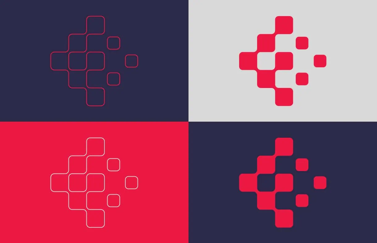
One way to stand out? A bold colour scheme. Our designers landed on a striking two-tone scheme of purple and red, with the red acting as a subtle nod to Fero’s roots in the healthcare world. Both colours are “emotional”—ones that help to add a sense of urgency to Fero’s mission: creating safe and accessible spaces for vulnerable populations.
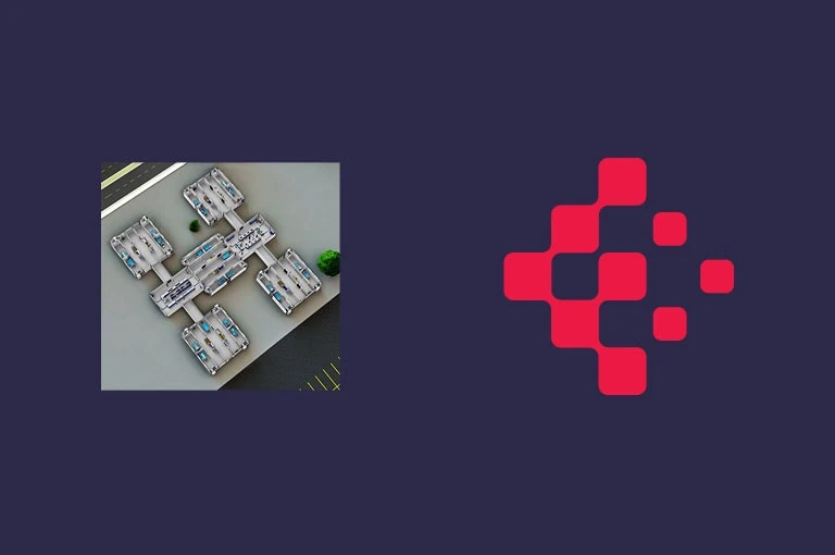
The design of the new logo suggests an aerial view of shipping containers joining together to create a recognizable “F” shape. To reinforce the modular nature of the business, we developed the logo so that it could either work as the logotype (with custom letterforms) and the symbol together or separately. Start-ups, in particular, need this kind of design flexibility as they build out their operations and discover new applications for their branding.
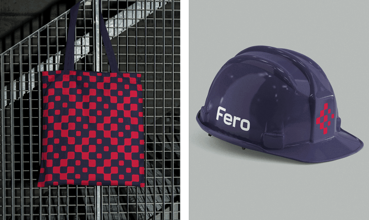
We applied this identity to the range of printed collateral that every growing business needs—letterhead, business cards, kit folders and proposal template—as well as digital assets, such as PowerPoint templates, investor decks and a digital background for virtual meetings.
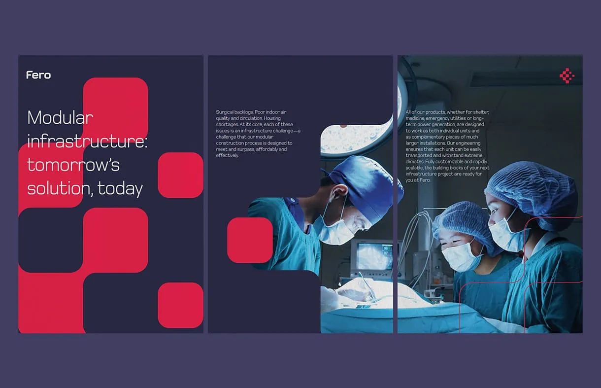
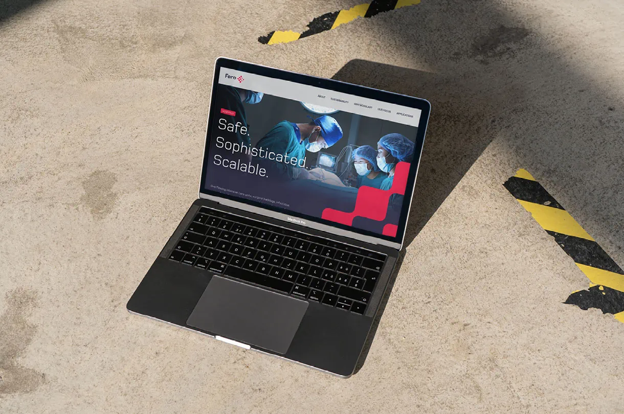
Finally, we brought all of the disparate elements of Fero’s new branding together in a new website. We created key messages to communicate Fero’s market positioning and value proposition to a variety of audiences. The result is a dynamic website filled with eye-catching headlines, imagery and informative (and interactive) graphics.
The overall outcome is a brand that provides a more cohesive visual identity that can scale as the company grows—not just within Canada, but around the world.