Spec Furniture
B2B / Brand implementation / Competitive audits / Graphic design / Ideation / Key messaging / SEO & Digital Strategy / Social media / Video / Website design / Website development

We’ve worked with Spec Furniture for more than a decade, helping communicate what makes them a key player in contract furniture: award-winning design, an industry-leading level of product customization, a leader in behavioural health, and a commitment to building durable, sustainable goods for hospitals, universities, offices and more.
Over the years, we’ve helped bring Spec’s brand to life in the social media sphere, updating and streamlining their presence on Facebook and Twitter. We’ve created motion-graphics videos for their YouTube channel, in which we animated the brand’s friendly, approachable personality.
Whether it’s through online ads, web banners, contest collateral or brochures, Spec has always challenged us to find new and inventive ways to keep their brand top of mind for their customers and partners.

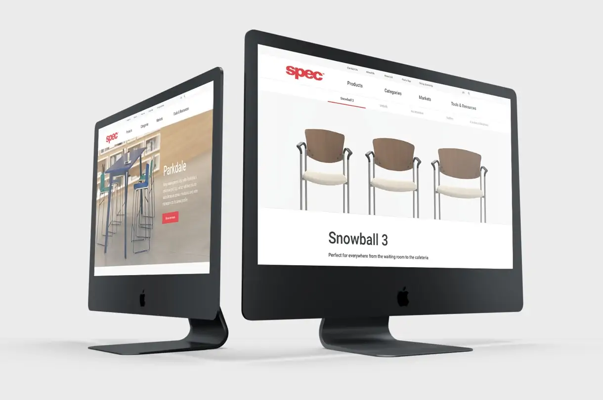
One notable project of ours was to lead the redesign and development of Spec’s website. They needed a site that was easy to navigate, and could house customer resources and nearly 1,000 product listings.
We began by mapping out the site architecture. Through the initial research and ideation process with Spec, we determined the different ways that contract furniture buyers search for products. Once we determined these ways, we ensured that the appropriate products could be found via various categories, ensuring that users’ search preferences were met. We then set about developing a menu that simplified navigation, so that it would never take more than one click for a user to find the products they were looking for.
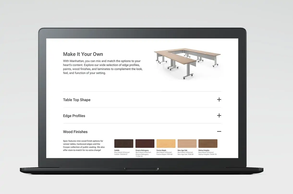
With the architecture established, we then brought one of the Spec brand’s biggest differentiators to the fore: their ability to customize nearly every one of their products in a wide array of paint and wood finishes, fabrics and other options that most competitors can’t offer.

We worked with Spec to include a “Make It Your Own” section on each product page to showcase the full breadth of customization available. Further, we built a fabric library, an all-new site feature that gives users details about the fabrics available for seating products, all sortable by filters including brand, pattern name and grade—a true asset for a company whose name is literally shorthand for “specify.”
Another way we helped the site resonate with users was by updating the website’s copy to a more natural and welcoming tone of voice. By consciously avoiding industry jargon, we felt that we could communicate the product’s features and benefits to a wider range of users. We also wrote headers and captions strategically to draw attention to these product benefits, employing lively copywriting to engage readers.
To get customers to the site in the first place, we had to be thoughtful with our search-engine optimization, drilling down into keywords and analytics to see just what purchasers are searching for, while at the same time being careful not to overdo it with SEO language. As a result, every product page was in the best position possible to not just attract readers, but hold their interest—and hopefully nudge them toward a purchase—as well.
The result? In a post-launch customer survey completed by Spec, 86% of respondents found the site easier to navigate, while a whopping 94% found the site more visually appealing.
