BOMA BEST
AODA/WCAG accessibility / B2B / Brand guidelines / Brand strategy & positioning / Competitive audits / Customer research & analysis / Graphic design / Ideation / Key messaging / Logo & brand design
We were engaged by BOMA Canada to create a new and expanded identity for the BOMA BEST program: North America’s largest environmental assessment and certification program for existing buildings, with more than 3,000 buildings certified in the program.
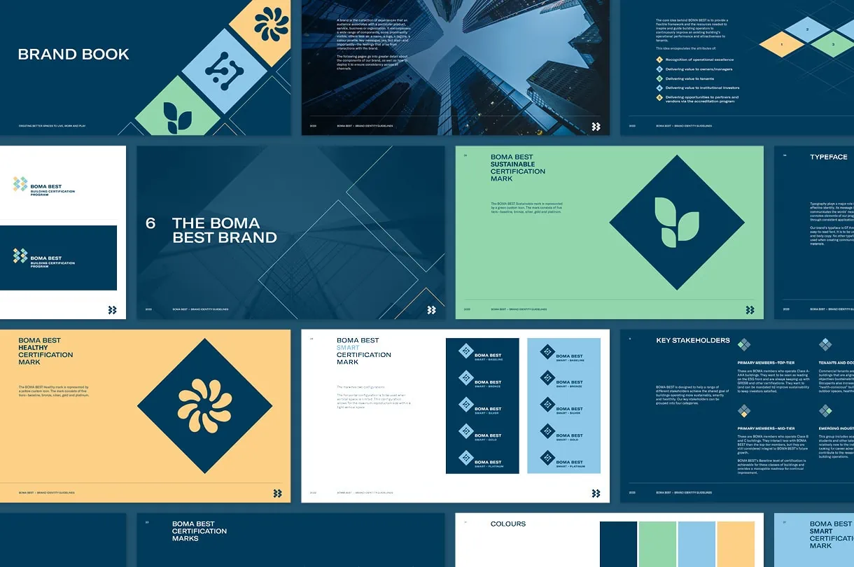
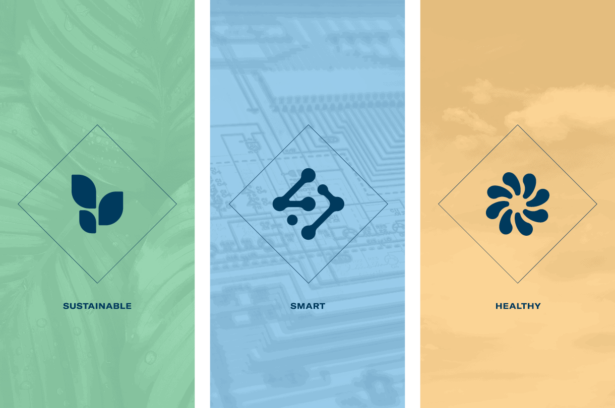
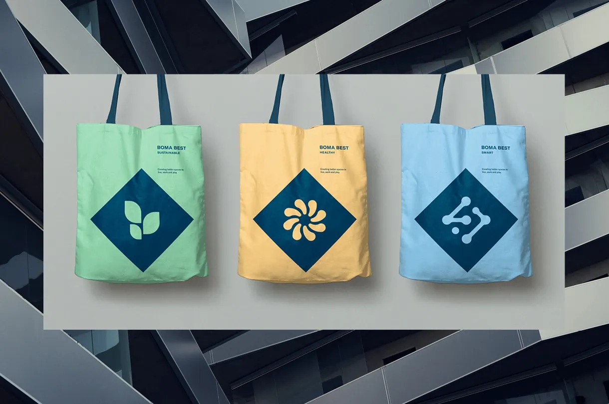
The BOMA Best program was created to certify buildings in the area of sustainability. BOMA Canada was expanding the program to include two additional areas: healthy buildings and smart buildings. As a result, the program was becoming increasingly complex and needed a new identity that would provide clarity for three streams (sustainable, healthy and smart), each with five tiers (baseline, bronze, silver, gold and platinum).
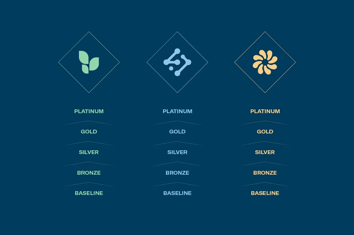
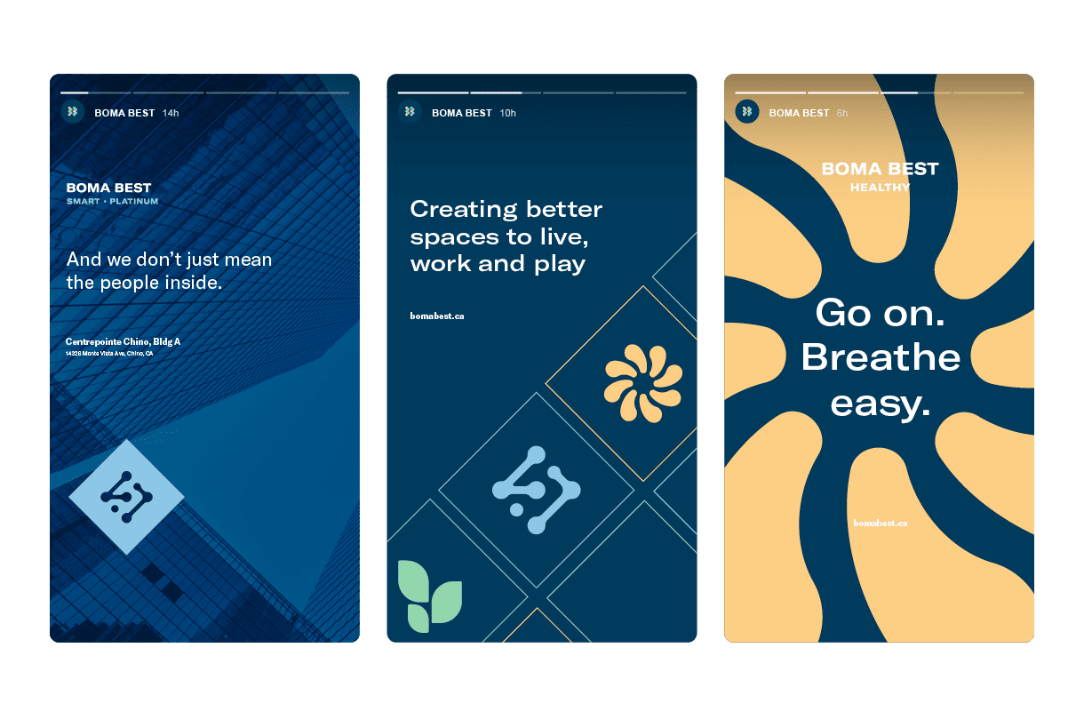
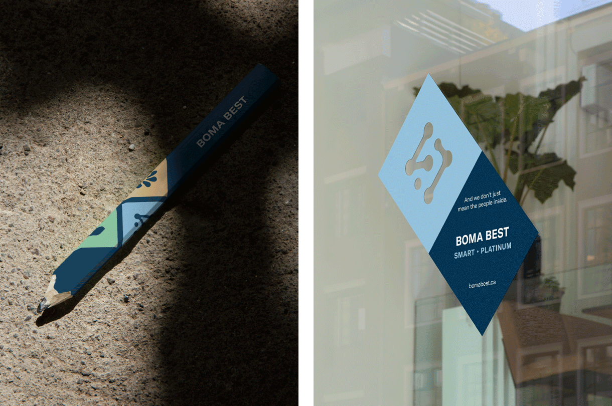
One of the larger challenges was to create a brand architecture that can easily communicate through building lobby signage, digital displays, etc. what combination of certifications and level(s) the building has achieved. This needed to be easily understood by building tenants who may have had little previous knowledge of the BOMA BEST brand.
We began by conducting and analyzing a competitive audit of the building-accreditation industry in Canada and—because the program was intended to be rolled out internationally—around the world. We followed this with an ideation workshop with the senior executive team, in which we shared research and insights, and discussed the needs of BOMA members and other stakeholders. These collective findings informed the design, positioning and communication choices we made to build out the BOMA BEST brand and key messages.
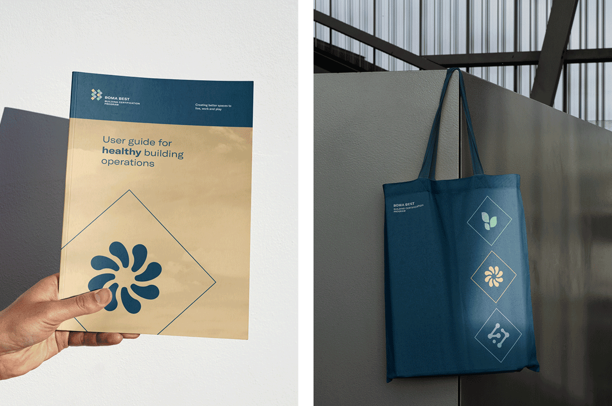
Once the branding and messaging was approved, we then created a brand guidelines document that could be used both to orient new employees and to allow the brand identity and messaging to be implemented by any number of regional chapters.