Malaviya Foundation
Brand implementation / Brand strategy & positioning / Competitive audits / Content creation / Customer research & analysis / Graphic design / Ideation / Key messaging / Logo & brand design / Squarespace implementation / Website design
Started by a small handful of close friends, the Malaviya Foundation is a philanthropic venture that recognizes Canadian excellence.
Recipients range from universities to hospitals to athletes (including Canadian Paralympians and Olympians)—anyone whose work and ambition has the potential to create a ripple of good throughout Canadian society.
The foundation wanted a brand identity that faithfully represented their personalities and passions, and, most importantly, their sense of fun.
We started with brand language and key messaging, capturing a brand voice that is authentic and friendly.
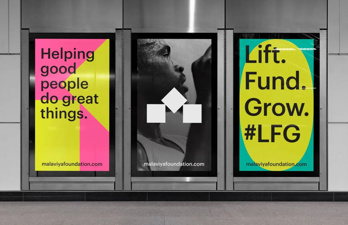
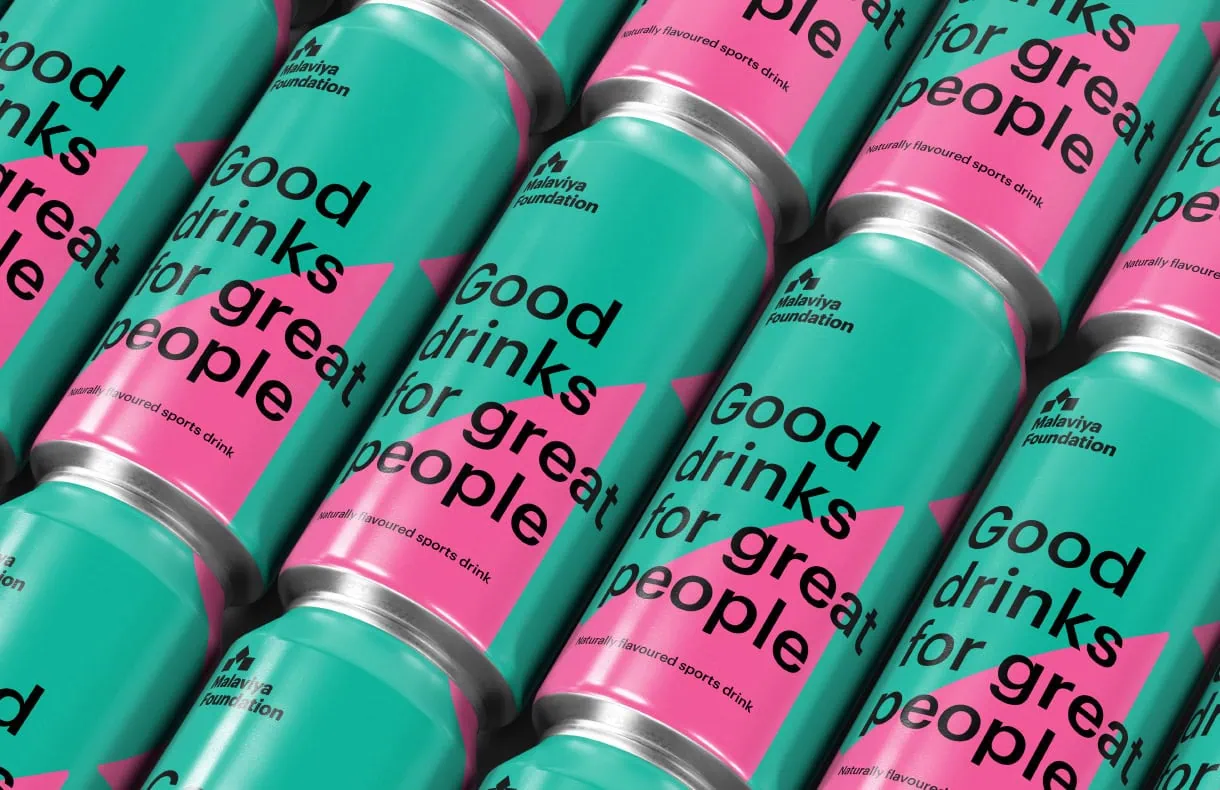
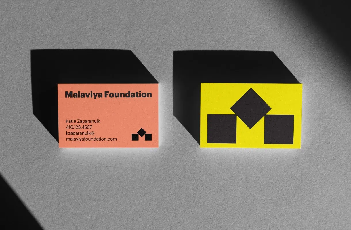
We then designed the logo, which encapsulates the essence of the brand—the recognition of top performers in any field (symbolized by a three-tiered podium). The stylized “M” serves as a visual anchor for all marketing materials—it is unique, memorable, and easily recognizable.
The foundation’s neon colour palette plays a crucial role in conveying emotion and evoking specific associations with brand values such as energy, excitement and performance. By establishing the brand’s personality in a bold way, the palette allows for consistency across all of the foundation’s touchpoints.
Bold and modern typography via a consistent typeface also help establish the tone (and support the memorability) of the foundation’s branded communications.
The overall graphic design system is flexible enough to adapt to different media and contexts, while maintaining its integrity. Whether applied to print collateral, digital platforms or environmental signage, the Malaviya brand is immediately recognizable across all channels.